What, me root for Michigan in the Orange Bowl? Hardly. Although you do have to give them respect for the devastation wrought upon No. 2 ranked Ohio State a few weeks ago.
But no, the title question relates instead to model railroad lighting.
Here's the Executive Summary:
I am experimenting with changing the lighting in the railroad room from "soft white", a warmish yellow,
to "daylight", a cooler blue. Want opinions! Read on for rationale, analysis, and spiritual angst.
Cool White
In the beginning, the model Earth was without warmth, and void. And cold gray from fluorescent tubes was upon the face of the layouts. And God said, "Let there be warm light!" And there was warm light.
Soft White
CF bulbs made their debut, and suddenly it was possible to light a model railroad with a cheerier, sunnier "soft white", without roasting your crew with incandescent bulbs, not to mention annihilating your electricity budget.
I seized upon this new technology - back when I cared about new technology - and built 41 "can" spotlights, illuminating the Suffolk Northern in its new quarters with a warm yellow light, at the total draw of a scant 583 watts.
However, it's often cloudy, misty, and dim in the Appalachians. I painted the sky with a very pale overcast blue. I painted the backdrop forest working from photos taken on a rainy day in the Blue Ridge - and ended up with a backdrop looking not cheery and sunny, but rather like a rainy day in the Blue Ridge. And as described in the Trees page, I accidentally created a blue-shifted palette with the foliage, that turned out to coincide nicely with the backdrop. All blue.
So for a while now I have been looking at that sunny yellow light falling on my blue forest and thinking it just ain't right. The feeling has been exacerbated by the CF's tendency to both dim and green-shift as they age.
Daylight
Enter LED bulbs. Now not only could I cut my wattage in half again, but I had an option to go with a 5000K "daylight" color - about the same Kelvin color temperature as "cool white", actually - but in a screw-base bulb I could use with my existing spotlight cans. I have had two of them aimed at the summit at Misty, W. Va. for a while, for contrast.
Well after the requisite number of months of ruminating, last week I finally went ahead and ordered enough bulbs to do one of the two rooms. I started with the west room, the much more mountainous and remote of the two. I plan to run with the half & half plan for a while, so I can see how I like it before making a final decision - to either "Go Blue", or roll it back to yellow.
Photo Pairs. Ish.
Here are a few before/after shots. Upon study you can tell some difference in the color of the trees, backdrop, and fascia, but unfortunately the point-and-shoot cell phone pics auto-correct for much of it. It really makes an impact in person.
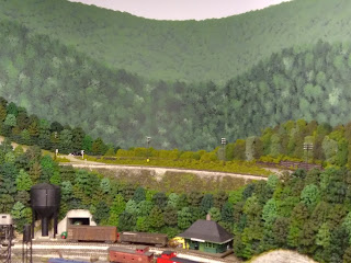
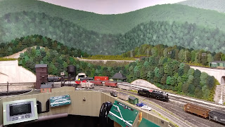
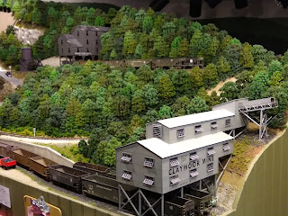
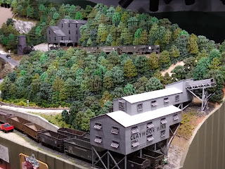
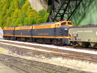
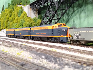
I would be delighted to hear opinions, on both the poor photo comparisons, as well as from ops crewmen once you've actually experienced it.
Preliminary Findings
1. The bluer color definitely eliminates the clash with the palette of the trees, backdrop, and sky. Things blend.
2. The effect is a bit striking. Maybe I'm just used to the aging CFs, but there's a glare on the layout that is definitely new.
Hi Keith! On my SP Lordsburg Sub, I'm using LED light strips (5 meters in length) that are rated as 4000K - 4500K (natural white) in color. They aren't warm white nor are they cool (blue) white. I think they look "just right" (from Goldilocks & the Three Bears)!
ReplyDeleteThanks Paul! Sounds perfect. Here we're fully installed with spots though, so we're limited to colors available with screw-base bulbs. So far the feedback from the crews favors the bluer "daylight" - so I will probably be going with that and changing over the second room.
ReplyDelete